
When someone visits your website for the first time, you have just a few seconds to make a powerful first impression. What your website communicates in those few seconds can make the difference between a customer and a lost opportunity.
If your magic website looks out-dated, unprofessional or difficult to navigate you’ve just lost a potential customer and left money on the table.
While there is a never-ending list of things we can do to improve our site, here are the critical factors that need to be addressed as Google introduces Core Vitals (a new ranking signal Google is announcing).
This is important stuff! Google rarely gives definitive information about its search algorithms. I love that Core Vitals is looking for what we all should be doing – creating a website for the user instead of for Google.
Fix these critical errors first:
Not Providing a Secure Website – HTTPS
I preach this all the time and am amazed to still see websites that aren’t secure. If your website isn’t displaying a padlock in the browser bar, you have security issues that need to be addressed.
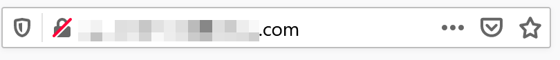
Back in 2017, Google announced it would be favoring websites that are https secure in the search results.
Now Google has gone further and will be flagging websites that aren’t secure. When I visit a website and see a nonsecure interface, I immediately move on because this signals that the site isn’t secure, and not being professionally run.
Remedy:
Contact your website host provider and have an SSL certificate installed. This might cost an annual fee but it’s well worth the cost because your customers will trust your website; any information they enter will be encrypted.

Sometimes, even after you have an SSL certificate installed you might not see the desired Padlock icon in the browser bar.
This means that some element(s) on your web page have not been added in “secure” mode. Sometimes this is an easy fix like adding an “s” to the http media file address, and sometimes you need to dive deeper.
If you aren’t able to figure out the problem, we can help you with that.
Not Displaying a Mobile Friendly Website
 In March of this year, Google will be implementing Mobile Only indexing which means Google will only crawl your website as it appears on a mobile device. Mobile Only affects not only what the visitor sees but also their ability to navigate your magic website.
Approximately half of all website traffic comes through a mobile device.
According to a 2020 report, mobile accounts for 70% of digital media time. And what’s even more compelling is that when comparing mobile vs. desktop traffic, email conversion rose as much as 70% for emails read on mobile devices, while desktop conversion dropped a bit.
I believe that as younger magic enthusiasts become the majority of website visitors, we will see these numbers hold steady or grow.
Remedy:
If you are using a Wix site or using older website technology, delivering a mobile friendly website can be challenging. While your Wix site might look fine on your phone, on a desktop or tablet it’s possible the right side of your website will be cut off if the browser isn’t at full size. I can always spot a Wix site because if my desktop browser isn’t full width I can’t see the right side of the website.
Whatever technology you’re using for your website, check out how it looks on different mobile devices and different desktop browser sizes.

Over Designing Your Website
I look at the above image and hear “Halleluiaha, halleliuhah… “
I can’t tell you how many times I’ve heard new clients say they want a website that really draws the user in with amazing design. “I want images moving and lots of color and make it a site they can’t take their eyes off of.”
Have you ever been to a website where everything is moving? From changing sliders to flashing buttons, swinging chandeliers and rotating images you don’t know where to focus or what to do.
We all love cool design, but let’s not forget the purpose of the website. It’s not to show how beautiful website design can be, or how many moving objects you can deliver. You’re not producing a piece of artwork or performance piece. The design needs to support your goal, be it selling products or services.
Always prioritize functionality over form because if the website doesn’t result in conversions (product sales, magician bookings, newsletter signups, etc.) then your website is no longer a business, but rather a beautiful expense. Google’s Core Vitals is all about delivering what the customer is looking for.
Let’s take a look at the Google website as an example. Google’s main business is to provide search for the internet. Google deliberately keeps the design clean and simple so that users are not distracted. Google wants you to use their search engine, and that’s the unequivocal focus of their home page.
Amazon focuses on helping you find products and deals. You will notice that Amazon’s home page is not about design – it’s about delivering the information you need to make a purchase decision. There aren’t fancy graphics or styling or fonts. Amazon’s home page is filled with products and product guides.
Remedy:
If you want visitors to perform a specific action, keep your website page clean and uncluttered, and focused on the goal. Tell the visitor what to do. Every page needs to have a focal point and a “call-to-action” you want the visitor to perform.

Not Using Images Appropriately to Engage and Communicate
Years ago I read a phrase that really resonated with me. “Writing about music is like dancing about architecture.” Words can’t truly communicate how all those musical notes, when combined the perfect way, turn into something so magical.
Like music, sometimes it takes more than words to evoke the right emotion, and draw the reader in. When was the last time you were drawn to a page of solid text. Exactly. But the right image will immediately grab your attention.
Remedy:
Integrate high-quality images where needed to help explain the content, provide context and draw attention.
Don’t add images just to fill the space. White space is okay. It directs focus to the important parts of the page. Website images are meant to serve a purpose, not be purely decorative.
Try to keep the image file size down to less than 100 kb when possible so that your page load time is not slowed.
Add alt-tags to each image so that Google and screen readers can identify what the image is about. Alt-tags help with SEO by providing a description of the image because search engines can’t properly identify what an image is about.
User tip: Official Website Accessibility Regulations (which require websites to be accessible to people with disabilities) are on the horizon and alt-tags provide the necessary information for images.
Don’t Use Complicated Navigation
I’ve seen many businesses create their main menu navigation based on how they purchase inventory or their knowledge of the product. This is not necessarily how the customer shops.
For example, one company had their entire product line categorizied by brand or how they inventoried products. While some of your customers may be devoted to certain brands and shop that way, it’s not ideal for the majority of your customers who are looking for a specific effect to incorporate into their next magic performance.
For magicians, a client might be looking for a wedding close-up magician or for a trade-show magician. Make sure your navigation fits how the visitor thinks and searches. Are they thinking about your magic style or searching by event-type?
 Keep your navigation logical; avoid spaghetti navigation in which case everything is linked and you have more categories or tags than products/posts.
If you click on a category or a tag and there are only a few items listed, it’s time to rethink your categories and tags.
Remedy:
If you sell recognized brands, separate them out from the other categories so visitors can shop by “Magic All-Stars,” or by magic category, etc.
Always make it as easy as possible for the customer. For magicians, think about what your customer is looking for: kids birthday, special occasions, weddings, tradeshows, conferences, etc. What is the event they need your services and create content and navigation that fits and resolves their search.
Ensure your navigation is easy to read. Sometimes menu drop-downs use a transparent background which makes it difficult to read; check that all content is easy to read.
The important areas of your website should be accessible from navigation in under 3 clicks.
Don’t make it necessary for a website visitor to click to see the navigation (or the drop-down menus below the main menu).
![]()
Some websites default to the mobile-friendly, hamburger stack, shown above, at the desktop level – this means I need to click on the menu just to see an overview of the website navigation.
When a user visits your website, the menu needs to immediately give them a sense of what content can be found. Don’t make visitors have to click to see the menu if they are on a desktop or larger tablet.
Wrap Up:
Google’s Core Vitals emphasize improving the user experience. View your website in your visitor’s shoes and fix the areas that cause friction or prevent the user from completing the desired action.
- First and foremost – if you’re still not using https on your website this is the year to take action.
- Ensure your website is easy to access on a mobile device.
- Every page needs a focal point and purpose. Don’t get caught up in the design. Focus on the end goal.
- Use high quality images when called for. Your website is brought to life with images so ensure every image looks great and has a purpose. Compress image file sizes down to under 100kb when possible.
- Keep the website navigation clean and intuitive so any visitor can easily find what they are searching for. This means you have to think like your website visitor.
We want to help you grow your magic business by providing website solutions, consulting, and best-practice advice. We offer an unprecedented combination of experience and passion for magic and website creation that you won’t find anywhere else.
If you’re not sure about what you need to do, contact us. We’ll give you strategic action items you can work with immediately, no strings or fees attached.
Want to uplevel your online business? Contact us for more ideas on how to grow your magic business.